Sarah Faulkner is a painter and wood and metal worker. Her work captures the bright whimsey of America's South. Take a moment to draw inspiration from her work.
December 23, 2009
Home to You
Today I am featuring the Peasall Sisters Home to You album, not just because of the enchanting harmonies these girls bring to the old fashion tunes, but because of the folksy album art. The design was created by Brezinka Design Co. The faded photos, hand lettered type and old timey color palate fit the Peasall's music genre perfectly. As I perused Brazinka's site I was impressed with the hand lettering and was taken with his illustrations. Check out the site, blog, and the Peasall Sisters Home to You CD to see more of this lovely work.
December 22, 2009
Artsy Personality
Marcy Gaudin- Bourgeois of Eclectic Orchid
Marcy assembles beautiful accessories from fabric and jewelry.
Must See
The Craft and Folk Art Museum in California is a great place to visit for new inspiration and a glimpse of world crafts. Check the hours before you go! I was unfortunate enough to find myself outside the 5814 Wilshire Boulevard shop on a Monday... they were closed. The building fits right in with the shops crafty vibe, and wide store front windows allow passers by a peek inside. Hours: Monday: Closed; Tuesday through Friday: 11 am - 5 pm; Saturday & Sunday: 12 pm - 6 pm
Make One
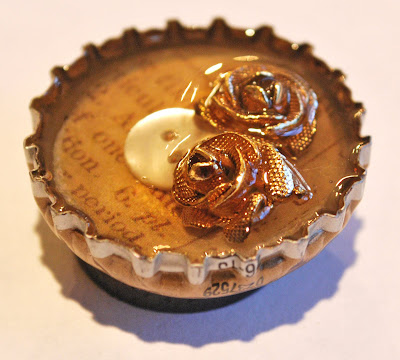
Over the past year I have been working on bottle cap magnet collages. I first saw this idea in a cute boutique where bottle caps were used as frames for photos from magazines. I wanted to take it a step further by creating decorative collages using paper, jewelry, buttons, etc. The composition is placed in a bottle cap and the cavity is filled with clear resin.
This set was created for a friend whose kitchen is teal with red accents.
As the resin hardened on this Canine set, the paper became blotchy. For the most part I don't like the look, but on the bulldog piece the type showing through on the reverse side adds another element of interest.
December 13, 2009
Wedding Invitation
This semester's final project is a synthesis of graphic design and hand stitching. I chose to create wedding stationery (invites, reply cards, etc.) These hand created pieces would be fabulous for the crafty couple wanting to communicate their personality to each guest.
December 9, 2009
Invitation Research
For my final project I am interested in creating stationery that incorporates both graphic design and hand done elements. So many have done it well. Below are just a few.
1) Fields | Elum 2) Thrive | Bella Figura 3) Clover | Moontree Letterpress 4) Greenwich Letterpress 5) Roseberry | Dauphine Press
December 1, 2009
Installation Up!
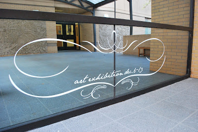
The final steps were taken today to complete the installation. The following photos recount the process.
So many thanks to Chris for helping me make my sketches a reality. Thank you Chris!

To my delight, the vinyl didn't give us any trouble about sticking to the textured tile surface.
So many thanks to Chris for helping me make my sketches a reality. Thank you Chris!
Applying vinyl

To my delight, the vinyl didn't give us any trouble about sticking to the textured tile surface.
The project was designed to be viewed from a specific location. The type will align correctly if you step on my feet indicators. However, you may need to shuffle forward or back if you are especially short or tall :) Come by the Sargent Art Building at BJU to check out the installation and the Mid-Year Exhibition!
November 25, 2009
Installation Update
Today the vinyl went up on the window. The next step will be applying vinyl type to the ground. The type will reflect into the window.
November 24, 2009
November 20, 2009
November 10, 2009
The Wall Project
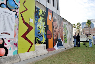
Today is November 9, 2009. Twenty years ago the Berlin Wall was torn down. Now, on the 20th anniversary of that epic event The Wall Project is resurrecting the structure in Los Angeles. The Wende Museum on Wilshire Boulevard is hosting this dramatic installation from October 17-November 14. Artists involved in the making of this piece include Kent Twitchell, Shepard Fairey, and Thierry Noir. I am grateful I got to see this piece of history exactly 20 years from the day it was torn down. (Read more about the ceremony and installation here.)
November 8, 2009
Guerrilla Bikes
I'm in sunny California this week and have my eye out for creative installations and guerrilla marketing ideas. I came across this classic Schwinn chained to an electrical pole in Newport Beach. This picture was taken a few yards from the ocean. Beach-goers interested in seeing more of the area can rent a bike ($5.50-8 per/hour) to explore Newport and Balboa Island. This cute vintage bike was placed nearby to promote the sport. I came across the same idea two years ago in Charleston, SC. The city wanted to promote bike riding for various reasons (parking, environmental, etc.) and did a fabulous job putting together bike installations with themes and colors to match surrounding shops.
I dug up the old pictures from Charleston. The last image is of the Blue Bicycle Books store. The adorable blue bike with a stack of appropriately colored books is irresistible! Who wouldn't want to stop in to browse?
October 30, 2009
Installation
So I've been pondering installations, guerrilla marketing campaigns and the like. I will soon be creating an installation so a little research is in order. There are great examples to be found of guerrilla marketing. These campaigns generally grab the viewers attention in a less obnoxious way than traditional advertising.
As a graphic designer I naturally want an installation to have a purpose... this could be to convey a message or to promote a product. The best example I thought of for installations promoting products is the store window. And when it comes to store windows who does it better than Anthropologie? They have a way of blending their installations into the space to create a functionally beautiful vibe.
Despite my musings on beautifully decorated shopping experiences, I don't know if that is the goal of this project, so I'll be researching more in the hours to come!
Most of these lovely Anthro images were taken here.
October 20, 2009
Synthesis
This project challenged me to combine my way of working with that of another artist. We were encouraged to choose an artist who worked in a completely different medium than our own.
Recently I have been experimenting with simple vector illustrations that use clean lines resembling those a pen might make. I wanted to find an artist who creates illustrations with strokes similar to mine. Kagan McLeod is an artist working in Canada. His work has a watercolory feel to it, so I wanted to incorporate my graphic strokes with his washy watercolor style. Below are photos documenting the process leading up to the final piece.
Recently I have been experimenting with simple vector illustrations that use clean lines resembling those a pen might make. I wanted to find an artist who creates illustrations with strokes similar to mine. Kagan McLeod is an artist working in Canada. His work has a watercolory feel to it, so I wanted to incorporate my graphic strokes with his washy watercolor style. Below are photos documenting the process leading up to the final piece.
Subscribe to:
Comments (Atom)


